==> Settings: Appearance <==
The appearance of this skin can be modified in many ways in the
skin.conf.
->> Theme (color) <<-
color = indigoAt line 70 you can set the color of this skin. This will change the primary color.
This does only affect the color. Detection of light / dark mode is available with every color.
The theme of the charts is set separately. See the charts page for more information.
Available colors you can choose from (some screenshots are in ligh mode, others in dark mode, colors are always the same):
red

pink

purple

deep-purple

indigo

blue

light-blue

cyan

teal

green

light-green

lime

yellow

amber

orange

deep-orange

brown

grey

blue-grey

->> Header <<-
Starting at line 78 you can set some header values and adjust the appearance of the header with the navigation bar and almanac.
All values here are found inside the
[[Header]] section.
Meta tags
Here you can set the values of the
<meta name="description"> and
<meta name="keywords"> tags.
description =
keywords = weather,weewx,neowx-material
Navigation

Set which links should be shown in the nav bar. Values: yes / no
current_nav_link = yes
yesterday_nav_link = yes
week_nav_link = yes
month_nav_link = yes
year_nav_link = yes
archive_nav_link = yes
Besides the page links you can add up to two more links at the end of the navigation menu. Leave these options empty to hide the links. In this example only custom link 1 will be displayed.
custom1_label = My fancy site
custom1_url = https://example.com
custom2_label =
custom2_url =
Almanac
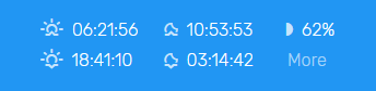
On the right side of the header bar you find the almanac.
If pyephem is installed (see installation), you will see sunrise, sunset, moonrise, moonset, the current moon phase and a more button to the almanac page (see screenshot).
If pyephem is not installed you will only see sunrise and sunset. Also the more button is hidden in this case because the almanac page only uses data which is available through pyephem.
Should the almanac be displayed? Values: yes / no
show_almanac = yesIf you want to hide the almanac in the header bar but want the almanac page to be accessible, you can add an almanac link to the navigation. Values: yes / no
almanac_nav_link = yesLogo
Should the logo be displayed in header? Values: yes / no
show_logo = yesIf the logo should be displayed, but you don't like the default one, you can specify the URL to a custom logo. Leave this empty to display the default logo.
custom_logo_url = https://example.com/image.jpg->> Footer <<-
All elements of the footer and the copyright line below can be set. Leave options empty to hide them.
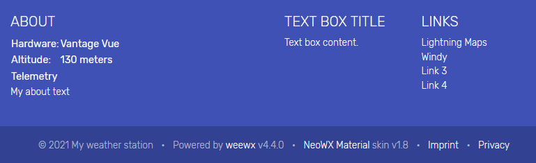
Set the name which will be displayed in the copyright line after the year:
name = My weather stationLeft column - about
By default the used hardware and altitude are shown here. You can optionally hide this information if you want. Values: yes / no
show_about_data = yesSet an optional small about text which will be displayed in the left column at the bottom:
name = My weather station
Should the link to the telemetry page be shown in the left column? Values: yes / no
This will only hide the link. The telemetry page will be generated and can be accessed by
direct URL. To disable the whole page generation see the
expert options page.
show_telemetry = yesMiddle column - text box
Optionally a box in the middle of the footer can be displayed. You can set the title and content here:
box_title = Text box title
box_content = Text box content.
Right column - links
The right column of the footer can display up to four custom links. Leave them empty to hide them.
By default link1 (lightning maps) and link2 (windy) is displayed. These two services
are a great and free addition to the features of your weather station and globally
available. But you can change them however you want.
Disclaimer: These two pages are just recommendations by us because we really like them.
We don't get paid or anything else, it's our own opinion.
link1_label = Lightning Maps
link1_url = https://www.lightningmaps.org

link2_label = Windy
link2_url = https://www.windy.com

link3_label = Link 3
link3_url = https://example.com

link4_label = Link 4
link4_url = https://example.com
In the copyright line you can display two additional links. It's meant to direct to your imprint or contact page and to your privacy page. But you can also show other links or hide them by leaving these options empty.
imprint_label = Imprint
imprint_url = https://example.com/imprint

privacy_label = Privacy
privacy_url = https://example.com/privacy
Do you want to support weewx and this skin by showing small credits in the copyright line? Values: yes/no
Setting this to no will hide the "Powered by weewx" or "NeoWX Material skin" credit line.
If you want to display them but increase the security you can optionally hide the version number.
support_weewx = yes
support_skin = yes
show_version = yes
->> Formatting <<-
Text date / time
Set the format how the date / time should be displayed.
It must be in the strftime format.
This is how dates of the today / yesterday pages should be displayed:
datetime_today = %H:%MThis is how dates of the week / month pages should be displayed:
datetime = %a %d %H:%MThis is how dates of month archive / year / year archive pages should be displayed:
datetime_archive = %d.%m. %H:%MCharts date / time
Same as above, but for charts. These date / time formats must be in a format which moment.js can read. See the formatting guide.
This is how dates of today / yesterday / week / month pages should be displayed in charts:
datetime_graph_label = dd DD HH:mmThis is how dates are displayed in tooltips in charts (currently not completely working):
datetime_graph_tooltip = dd DD.MM. HH:MMThis is how dates of year pages should be displayed in charts:
datetime_graph_archive = DD.MM.YY->> Appearance <<-
This section contains further styling options and the possibility to order or hide the displayed data.
Here you can change the order of all cards and their appearance. You can also remove values to hide them.
Note: Cards and charts without data won't be shown, even if you declare them here.
Values order
The order of values cards (left column). This list is very long and contains all values which should be displayed. You can remove some or add your own. All observations of weewx are supported. But the most common are already included in this list.
values_order = outTemp, outHumidity, barometer, windSpeed, rain, heatindex, inTemp, UV, ...Supported sensors / observations out of the box:
- outTemp
- outHumidity
- barometer
- windSpeed
- rain, snowDepth
- dewpoint
- windchill
- heatindex
- inTemp
- inHumidity
- UV, ET, radiation
- appTemp
- cloudbase
- extraTemp1 ... extraTemp8
- extraHumid1 ... extraHumid8
A small incomplete list of sensors / observations which are not included by default but can be added manually:
- leafTemp1 / leafTemp2
- soilTemp1 ... soilTemp4
- soilMoist1 ... soilMoist4
Charts order
The order of the charts cards (right column). This list is also very long and contains
all charts which should be displayed. You can remove some and change the order.
Because some charts contain multiple data and are defined manually they are skin-specific
and can't be set freely like in the values_order.
charts_order = outTemp, windchill, barometer, rain, windSpeed, windvec, UV, inTemp, ...These charts are available out of the box (they are all set by default):
| Name | Type | Description |
|---|---|---|
outTemp |
Area | Outside temperature and dew point |
windchill |
Area | Wind chill and heat index |
barometer |
Area | Barometer |
rain |
Bar | Rain |
snowDepth |
Bar | Snow depth |
windSpeed |
Area | Wind speed and gust speed |
windvec |
Radar | Wind vector (wind rose) |
UV |
Area | UV |
ET |
Area | ET |
radiation |
Area | Radiation |
outHumidity |
Area | Outside Humidity |
inTemp |
Area | Inside temperature |
inHumidity |
Area | Inside humidity |
appTemp |
Area | Apparent temperature. It will be added to the wind chill / heat index chart |
cloudbase |
Area | Cloudbase |
extraTemp1 - extraTemp8 |
Area | Single chart with extraTemp1 ... extraTemp8 |
extraHumid1 - extraHumid8 |
Area | Single chart with extraHumid1 ... extraHumid8 |
These charts are available out of the box, but NOT enabled by default:
| Name | Type | Description |
|---|---|---|
leafTemp |
Area | leafTemp1 and leafTemp2 |
soilTemp |
Area | soilTemp1 ... soilTemp4 |
soilMoist |
Area | soilMoist1 ... soilMoist4 |
Telemetry order
The order of the values on the telemetry page can be set as well. Here you can also change the order or remove values which you don't want to have displayed.
By default all telemetry sensors which are available in WeeWX are shown if they have data.
telemetry_order = rxCheckPercent, txBatteryStatus, windBatteryStatus, ...Supported telemetry out of the box:
- rxCheckPercent
- txBatteryStatus
- windBatteryStatus
- rainBatteryStatus
- outTempBatteryStatus
- inTempBatteryStatus
- consBatteryVoltage
- heatingVoltage
- supplyVoltage
- referenceVoltage
- extraBatteryStatus1 ... extraBatteryStatus8
The telemetry page shows the current value of each available telemetry, 24 hours max and min values and also an area chart of the last 24 hours.
Trend arrows
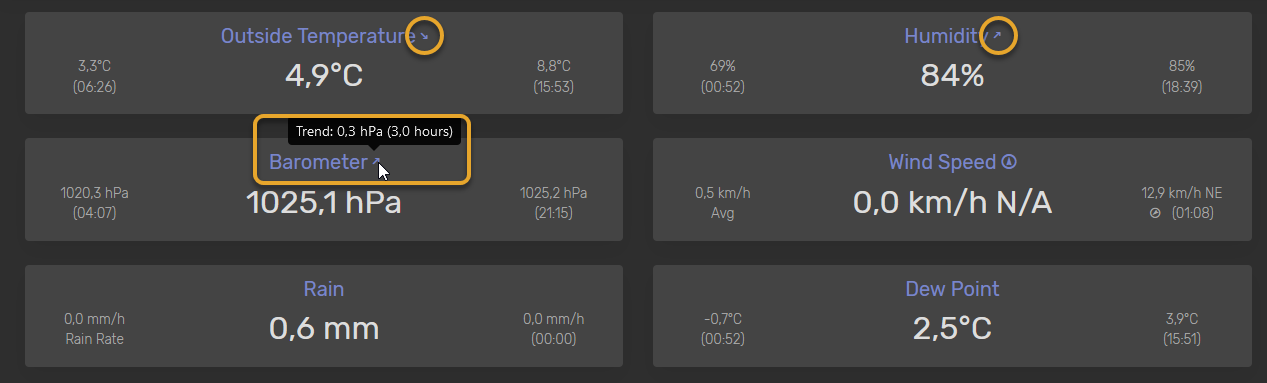
Display trend arrows on each value card. Here you can set on which cards
the trend arrow with a tooltip should be displayed. Note that the trend is
calculated automatically and the trend period is set in the
weewx.conf.
show_trend_on = barometer, outTemp, outHumidity, inTemp, inHumidity, UVShow coordinates on TXT reports
The NOAA TXT reports (found in the archive) contain the coordinates of your weather station (latitude, longitude) by default. Here you can disable this. Values: yes / no
show_coordinates = yesLight / Dark mode
By default the theme mode (light or dark) is set based on the user's device settings (auto). A device in dark mode will always get the dark mode theme displayed.
If you want to force a specific theme mode (only light or only dark) you can set it here.
Values: auto / light / dark
mode = autoColors of min / max values
By default the min value (small left value in most cards) and the max value (small right value in most cards) are grey. To make it clearer that these are min / max values you can set a custom color here. Leave this empty to show them in default grey. Note that this will only make the min / max values colorful. Other values on the left or right of a card (e.g. rain rate) will remain grey.
The color can be any valid value for the CSS color
attribute. If you use a hex code set this in quotes because this is needed for
correct configuration processing.
lo_value_color = "#03a9f4"
hi_value_color = "#f44336"