==> Settings: Charts <==
The charts can also be modified in many ways in the
skin.conf.
To have charts with more features, a modern responsive design and a great look this skin doesn't use the built-in graph plotter of WeeWX. Instead this skin only takes the data of weewx, stores it in an array and displays all values as beautiful charts.
For the charts we use ApexCharts. You can also easily modify the configuration of the charts in the JS code so you can use the whole functionality of ApexCharts.
->> Basic Styling <<-
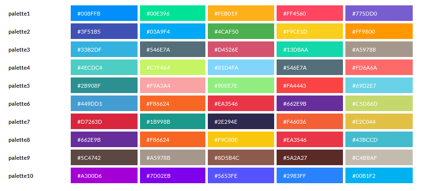
You can choose from 10 different color palettes.
Just set the palette you want as: palette1 ... palette10
These palettes are available. Screenshot is taken from the ApexCharts theme docs.
palette = palette1Set the height of all charts in px:
height = 300->> Strokes & Markers <<-
Set the styling of the strokes (lines).
The stroke curve can have 3 different modes:
smooth |
connects points in a curve fashion (spline) (default) |
straight |
connects points in straight lines |
stepline |
connects points by horizontal and vertical lines, like a staircase |
You can also set the stroke width in px. Default: 2
Markers can also be shown. These are small dots on each data point. By default they are hidden (size: 0) so we only see the line. This is also set in px.
stroke_curve = smooth
stroke_width = 2
markers_size = 0
->> Timespans <<-
For each chart the skin loops through all records in the specified interval. So for the week template the skin goes through the data of the last seven days.
But your weather station might update often so you store a record for example every minute.
Because these would be way too many values and processing and displaying would be very slow and buggy we go through this interval in specific timespans.
When you hover over a chart you can see that each data point on it is a specific amount of time between. On the "current" page each temperature value shows the average of 10 minutes. So you have an entry at 9:20 and the next one at 9:30.
If you have too much data shown with a bad performance or have a different archive period which causes gaps in the charts, you can change the timespan here.
The timespan is set in seconds for each template. Because rain (bar chart) is usually aggregated over a longer period of time this can be set separately. On the "current" page this is one hour by default.
Note: Year and month archive templates will always have a 1 day timespan for each data point due to technical limitations.
# Current / Yesterday
current_timespan = 600
current_rain_timespan = 3600

# Week
week_timespan = 14400
week_rain_timespan = 21600

# Month (only current month!)
month_timespan = 21600
month_rain_timespan = 86400

# Year (only current year!)
year_timespan = 86400
year_rain_timespan = 604800| Key | Default seconds | Conversion |
|---|---|---|
current_timespan |
600 | 10 Minutes |
current_rain_timespan |
3600 | 1 Hour |
week_timespan |
14400 | 4 Hours |
week_rain_timespan |
21600 | 6 Hours |
month_timespan |
21600 | 6 Hours |
month_rain_timespan |
86400 | 1 Day |
year_timespan |
86400 | 10 Minutes |
year_rain_timespan |
604800 | 1 Week |
->> Charts Order <<-
To change the order of the charts or hide a chart, update the
charts_order:
charts_order = outTemp, windchill, barometer, rain, windSpeed, windvec, UV, inTemp, ...See the "Charts order" section on the Appearance page for more information.
->> Charts Titles <<-
By default the title of the chart is the label name of the first
data series. At the outTemp chart this would be the label for
outTemp, which is Outside Temperature.
To change a name you can add a custom translation at the end of the
[[Charts]] section.
The key is always the name of the chart. See the specified names in
charts_order for more information.
[[[Titles]]]
    outTemp = "Outside Temperatures"
    windchill = "Apparent Temperatures"
In this example the outTemp chart and the windchill / heatindex / appTemp chart would get a custom title.
Don't forget to uncomment this section if you want to use this feature. By default, this is disabled.